ByHeart Work
![]()

Client
ByHeart
Role
Art Director and Designer
creative director
Tricia Desjardins
ByHeart
Role
Art Director and Designer
creative director
Tricia Desjardins
Overview
ByHeart is an infant formula company producing nutrition products locally in the U.S., grounded in breast milk science and featuring a patented protein blend with clinically proven benefits. As a Senior Designer, I partnered with growth, lifecycle, and product teams to shape creative strategy across acquisition, retention, and on-site experience, ensuring the brand tells a cohesive story while balancing brand integrity with performance.
I led performance marketing creative, concepting and producing work that ranged from elevated, brand-aligned visuals to UGC-style content, including the breakthrough ad of the year.
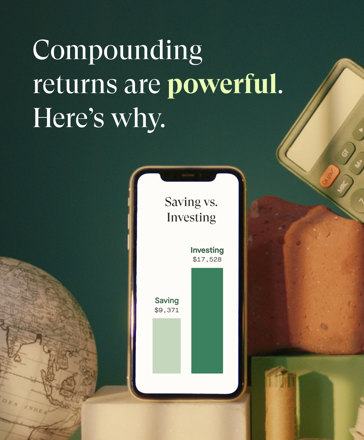
I revamped the welcome email flow to strengthen early customer engagement, refining messaging hierarchy, visual pacing, and modular design systems to improve clarity and conversion. Across lifecycle efforts, I focused on building repeatable frameworks that allowed the team to test quickly while maintaining brand consistency.


creative director
Tricia Desjardins
Director of ecommerce
Rachel Malone
ux designer
Lauren Jordan
Tricia Desjardins
Director of ecommerce
Rachel Malone
ux designer
Lauren Jordan
On the product side, I oversaw the PDP redesign, aligning product education, trust signals, and visual storytelling to better support purchase decisions. The redesign clarified key differentiators and created a more cohesive, confidence-building experience for parents.
Beyond digital, I extended the brand into tangible touchpoints, including printed mailers, brochures, and company swag, ensuring that physical experiences felt as intentional and elevated as the digital ecosystem.
Beyond digital, I extended the brand into tangible touchpoints, including printed mailers, brochures, and company swag, ensuring that physical experiences felt as intentional and elevated as the digital ecosystem.


Developed a high volume of paid social creative for ByHeart, translating brand storytelling into conversion-focused ads that drove customer acquisition.


Ellevest Brand Refresh
![]()

Client
Ellevest
Role
Art Director and Designer
creative director
Christina Valiquette
Ellevest
Role
Art Director and Designer
creative director
Christina Valiquette
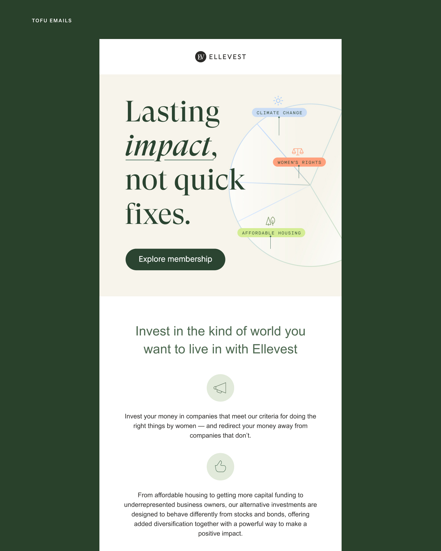
The problem
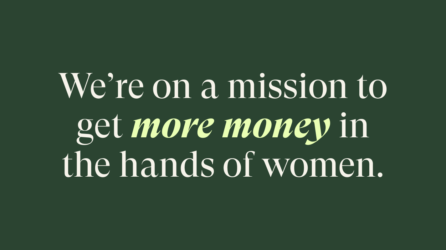
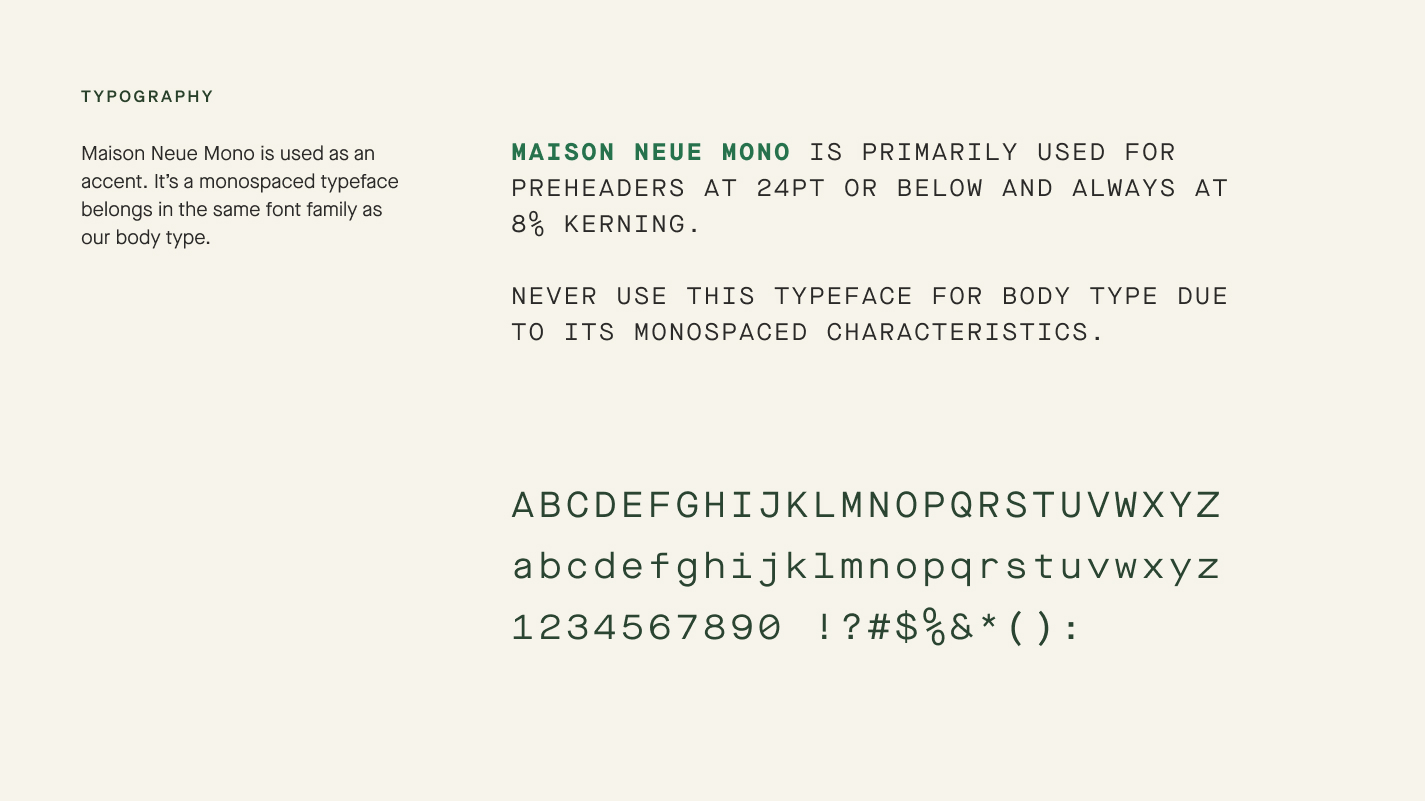
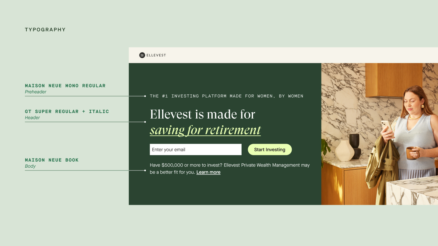
Ellevest’s type and color systems were established when the brand first launched back in 2016 — as the business and brand grew, all areas of its experience have evolved and elevated (photography, color, illusrations etc) but, because of technical limitations, type has remained untouched.The old typography suite is made up of 3 open source typefaces: Playfair, Merriweather and Lato. This type suite is not distinctive or ownable to our brand. It has also caused technical and accessibility issues and limitations within our product and marketing touch points.
The solution
As Ellevest begins to position its brand as an even more elevated offering, updating the design system to reflect that value is a crucial step that will help validate a higher price point.
project goals
- Elevate the branding to be more distinctive and ownable
- Bring the look and feel of our type and colors up to speed to serve new current business needs to help drive perceived value
- Ensure legibility, functionality and accessibility across all platforms


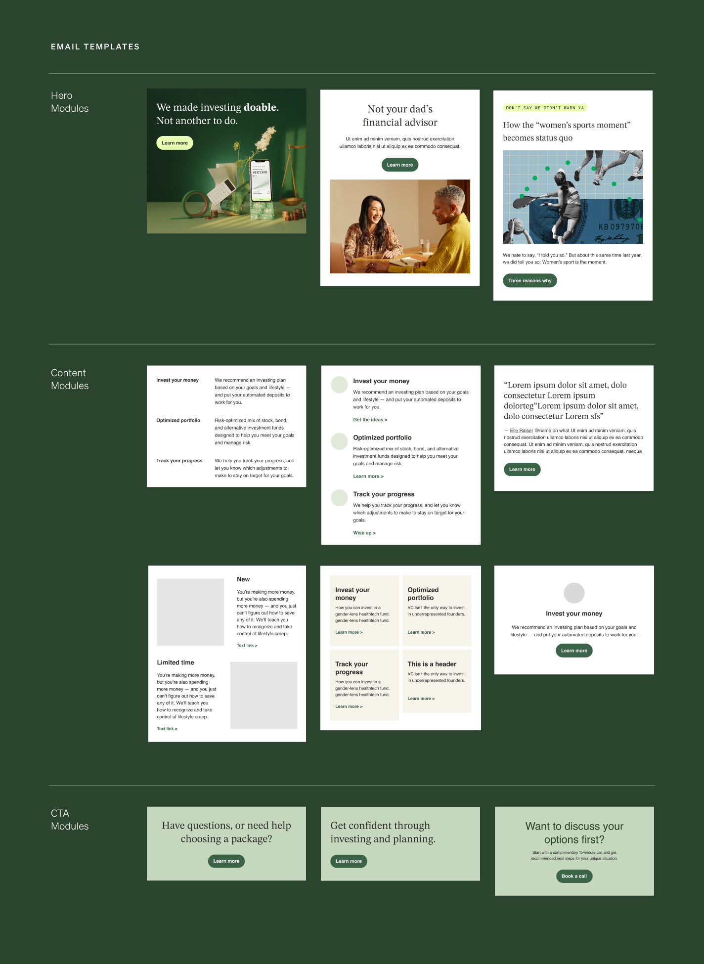 Worked closely with a developer to build a modular email template library, streamlining our workflow to keep up with an increased email marketing cadence.

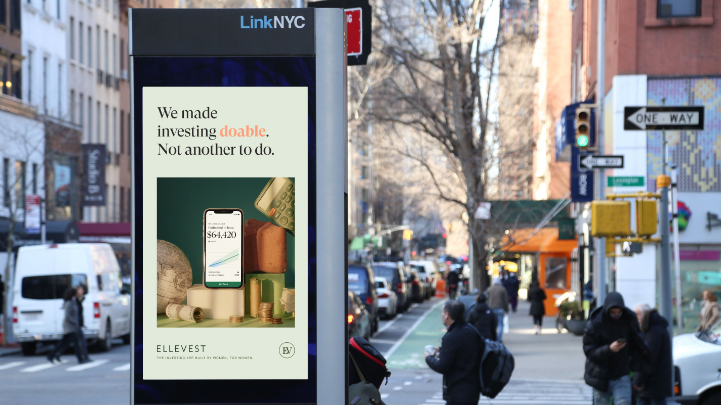


Ellevest Paid Content

Client
Ellevest
Role
Art Director
Designer
Motion designer
Copywriters
Tasbeeh Herwees
Melissa Warren
Motion design support
Robert Sommerlad
Ellevest
Role
Art Director
Designer
Motion designer
Copywriters
Tasbeeh Herwees
Melissa Warren
Motion design support
Robert Sommerlad
OVERVIEW
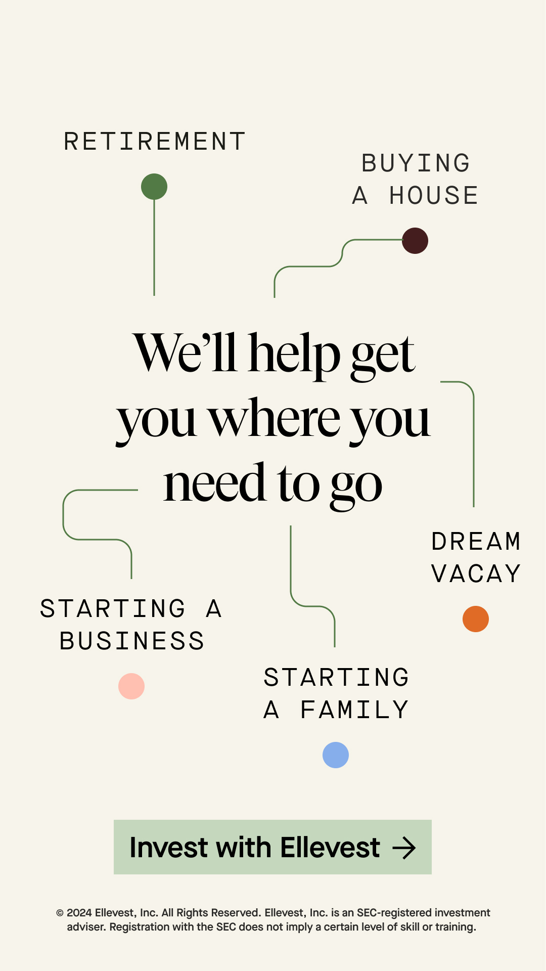
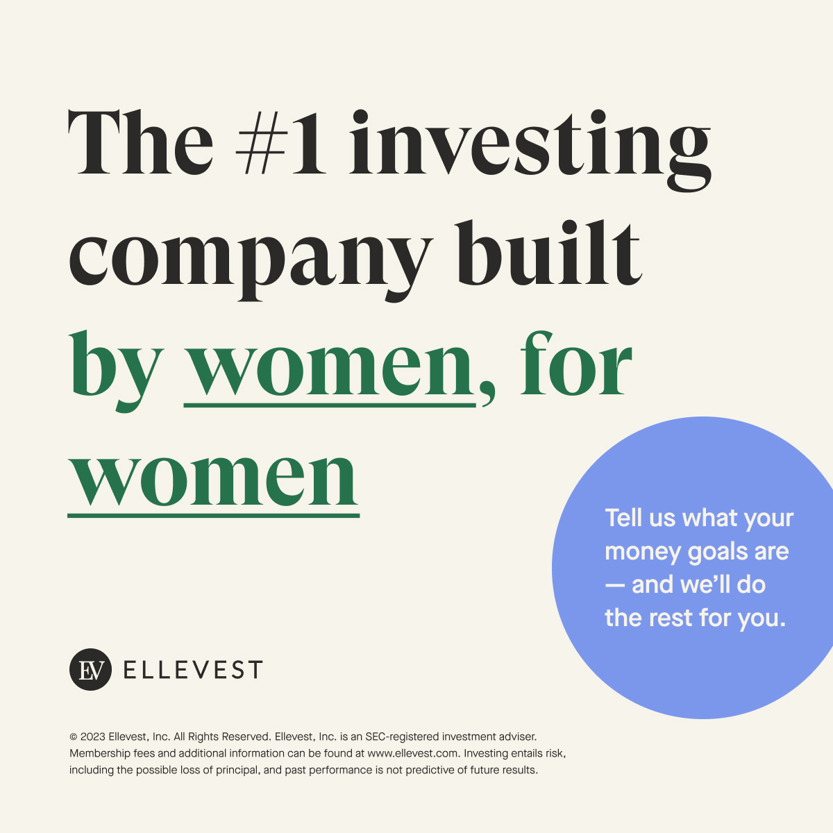
Worked directly with Growth Marketing director and copywriter to craft thoughtful and compelling visuals that drive brand awareness and acquire new users.
Worked directly with Growth Marketing director and copywriter to craft thoughtful and compelling visuals that drive brand awareness and acquire new users.


Grooming Lounge
![]()
Client
Grooming Lounge
Role
Art Director
Designer
Grooming Lounge
Role
Art Director
Designer
Overview
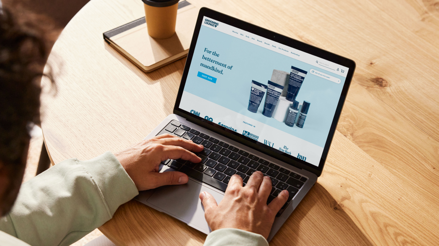
Originally launched as a barbershop and men’s spa in D.C. and Northern Virginia, Grooming Lounge has grown into an e-commerce destination for luxury men’s grooming products and services. While the brand was well-known locally, founder Mike Gilman aimed to expand its digital presence and elevate its in-house skincare line.
THE ASK
• Refresh the Grooming Lounge brand to attract a broader clientele.
• Redesign the website to enhance navigation and increase sales.
Solution
-
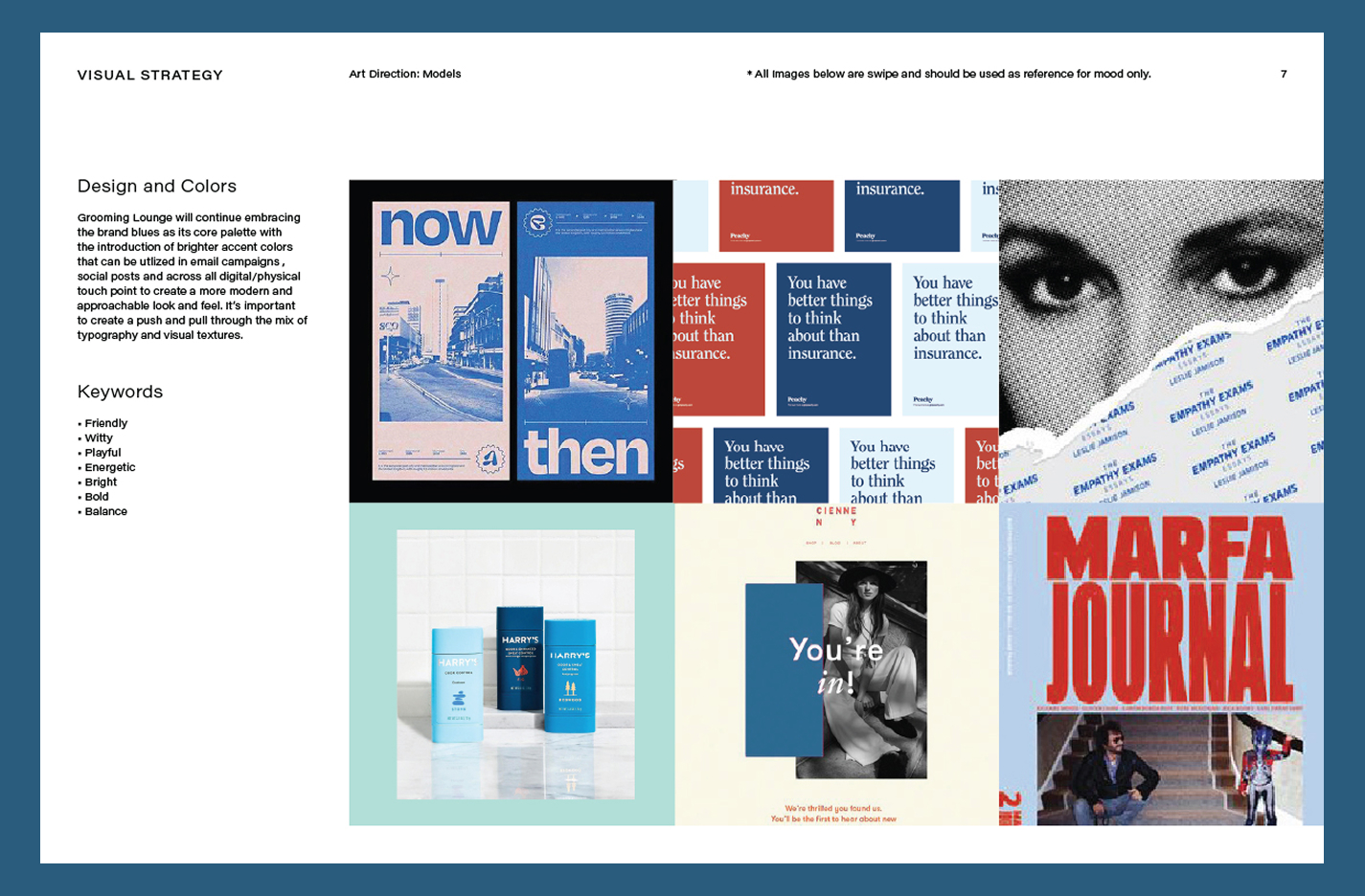
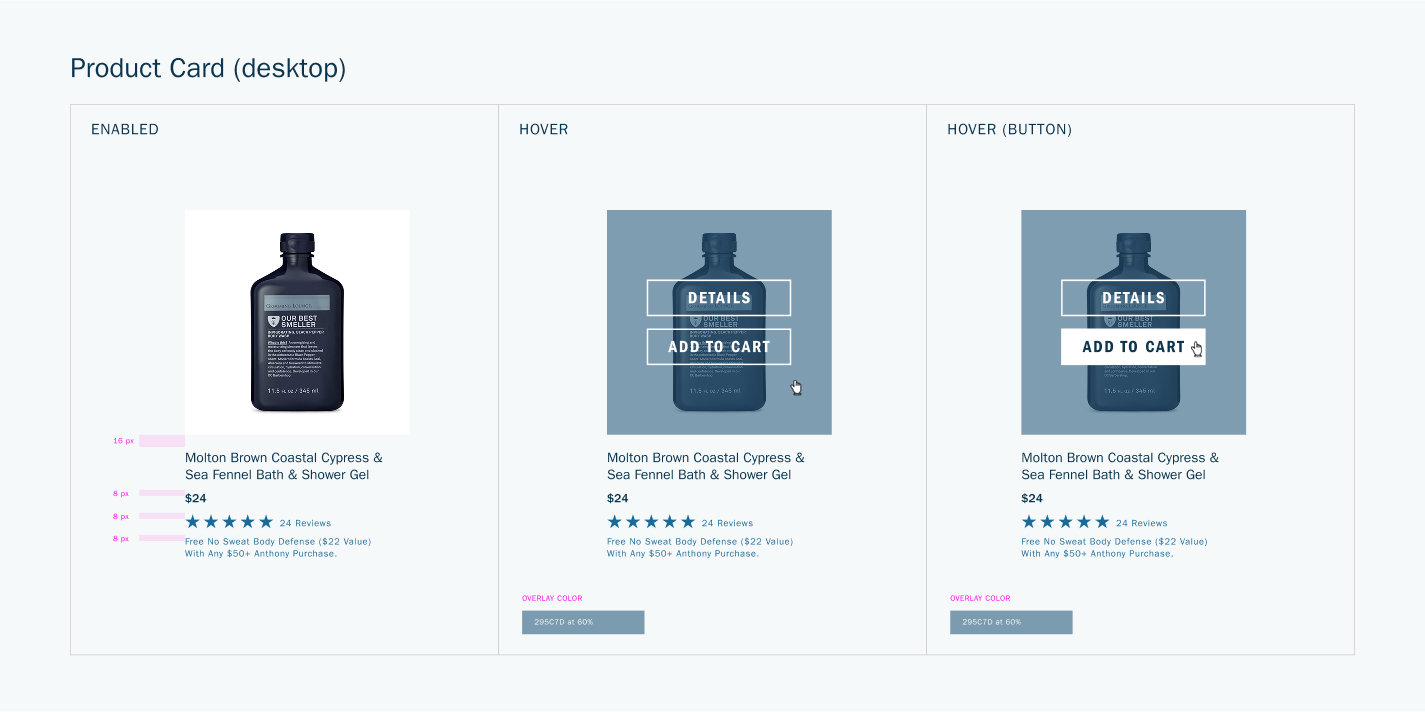
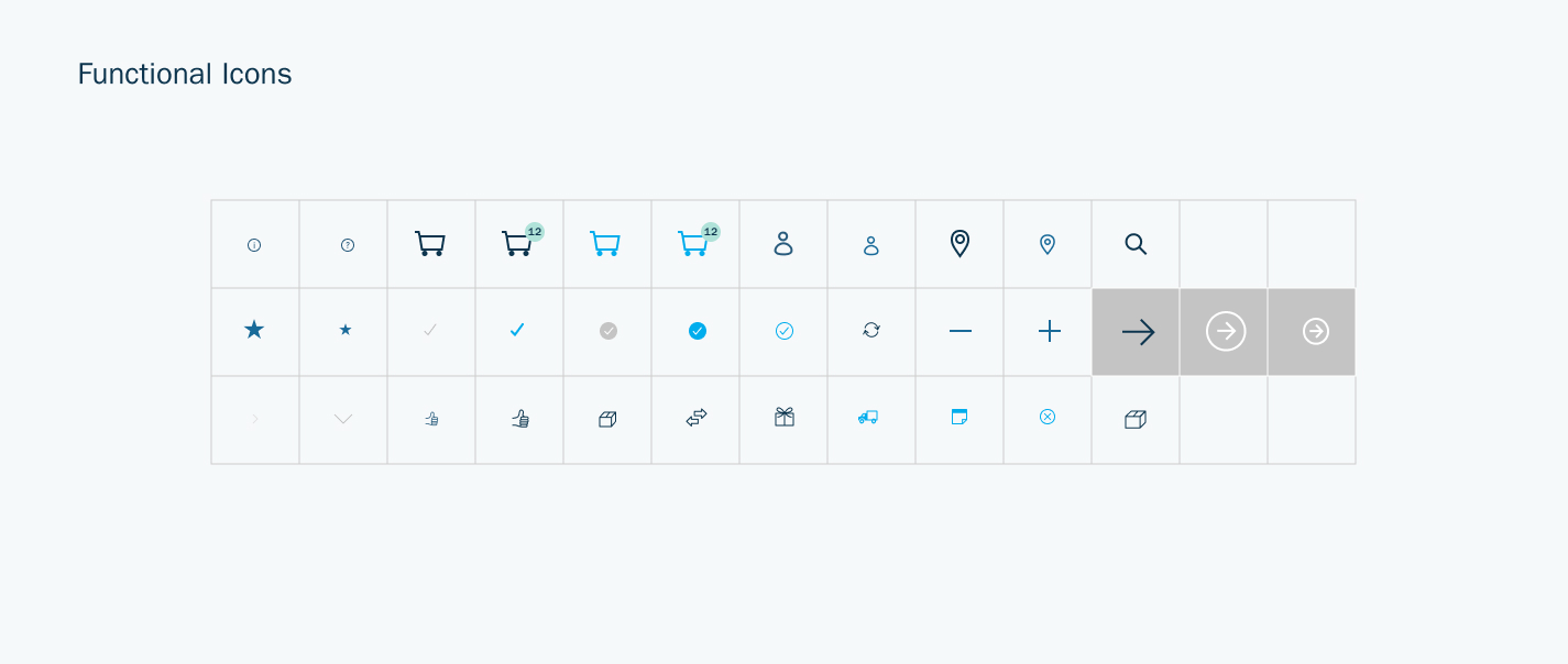
Developed a modern design system that refined and elevated existing brand elements.
-
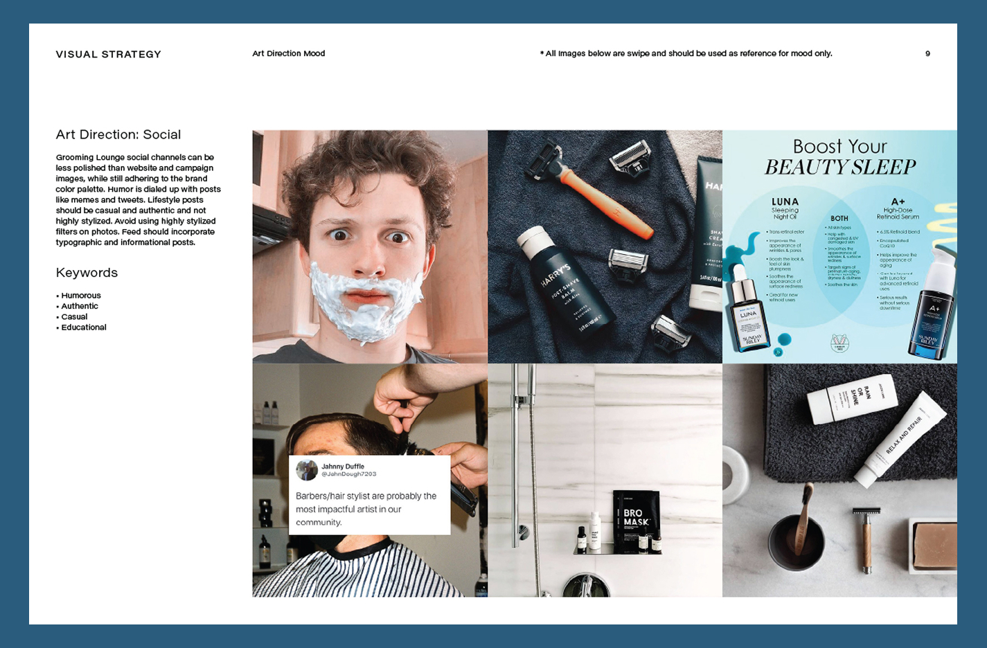
Created new marketing assets to enhance brand storytelling and engagement.
-
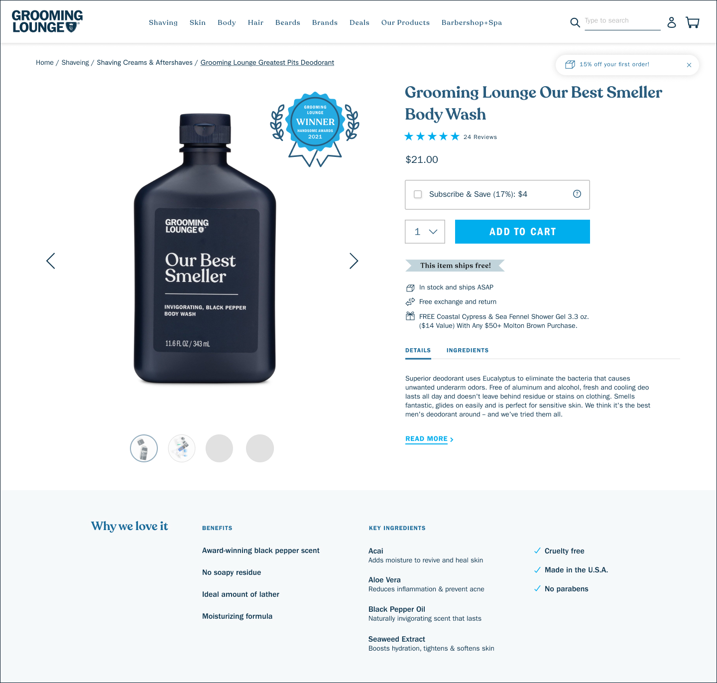
Established a product photography guideline to ensure visual consistency across the site.
-
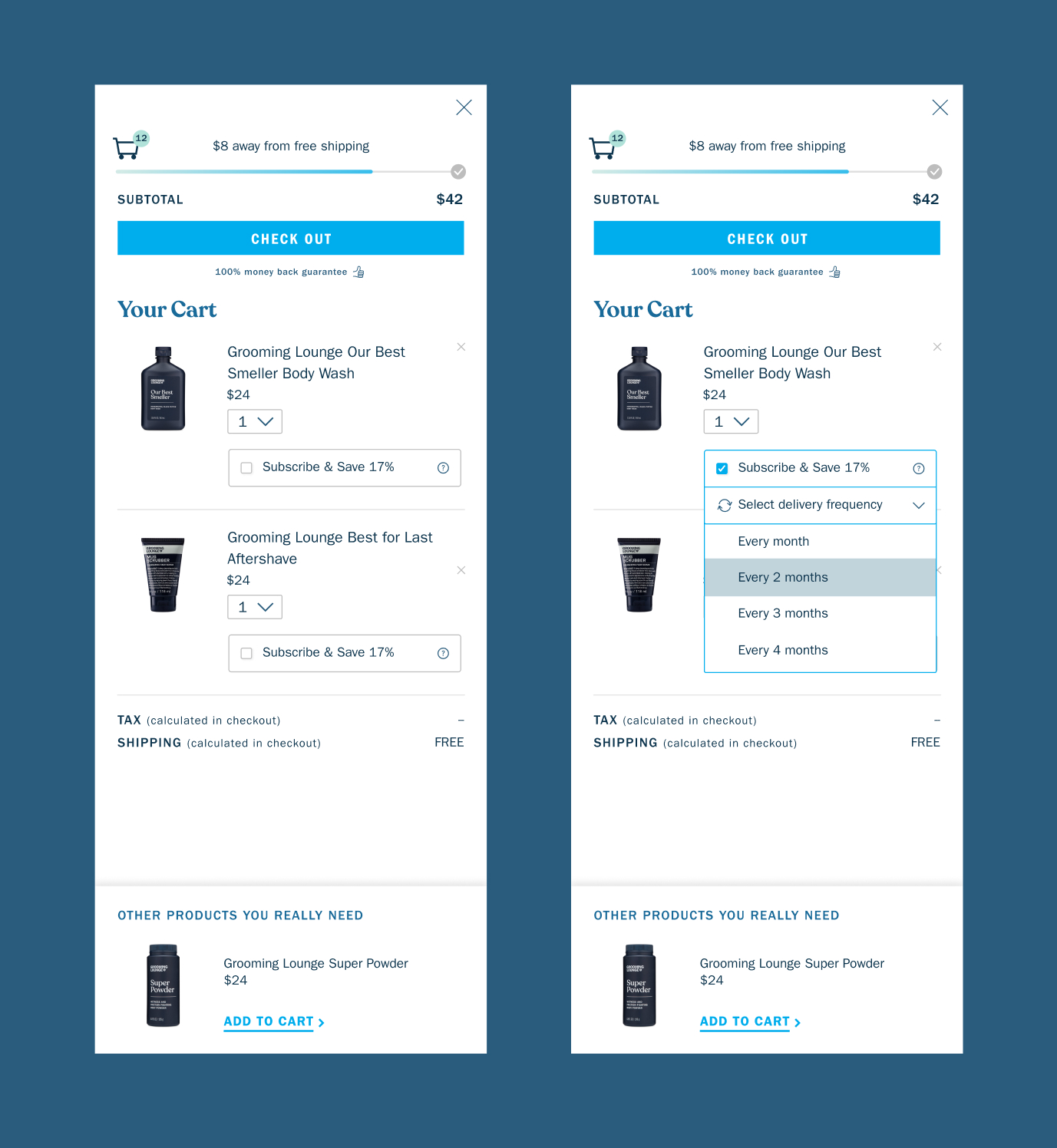
Redesigned the website with a more intuitive user experience, including
➝ A streamlined cart view featuring product upsells, a free shipping progress bar, and subscription service promotions.
➝ Optimized site navigation to help customers find products with ease.
-
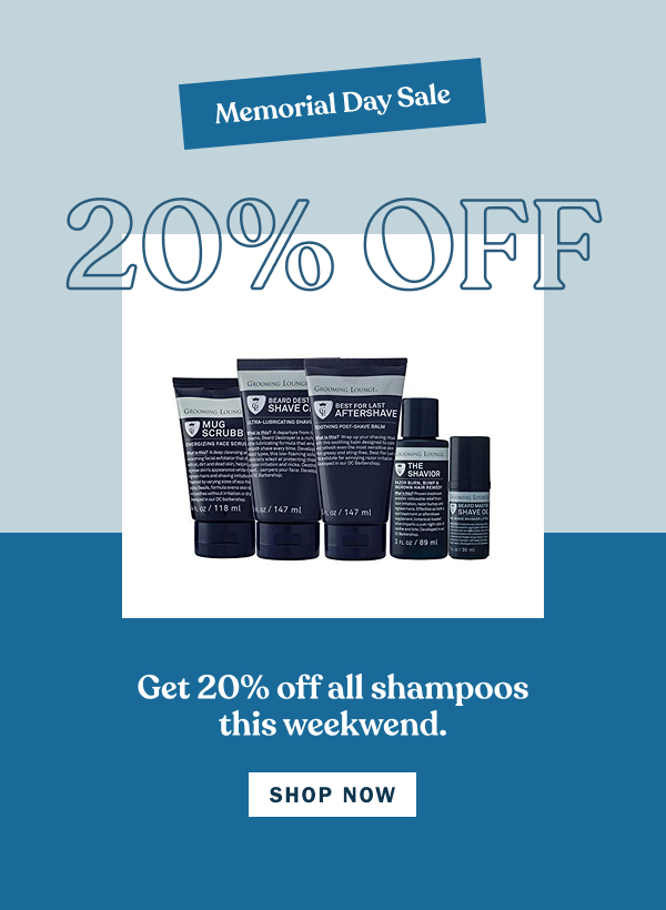
Designed a series of dynamic email templates to engage and retain customers.


A detailed brand guidelines that provide directions for design system, photography, UGC content, enail templates, etc.

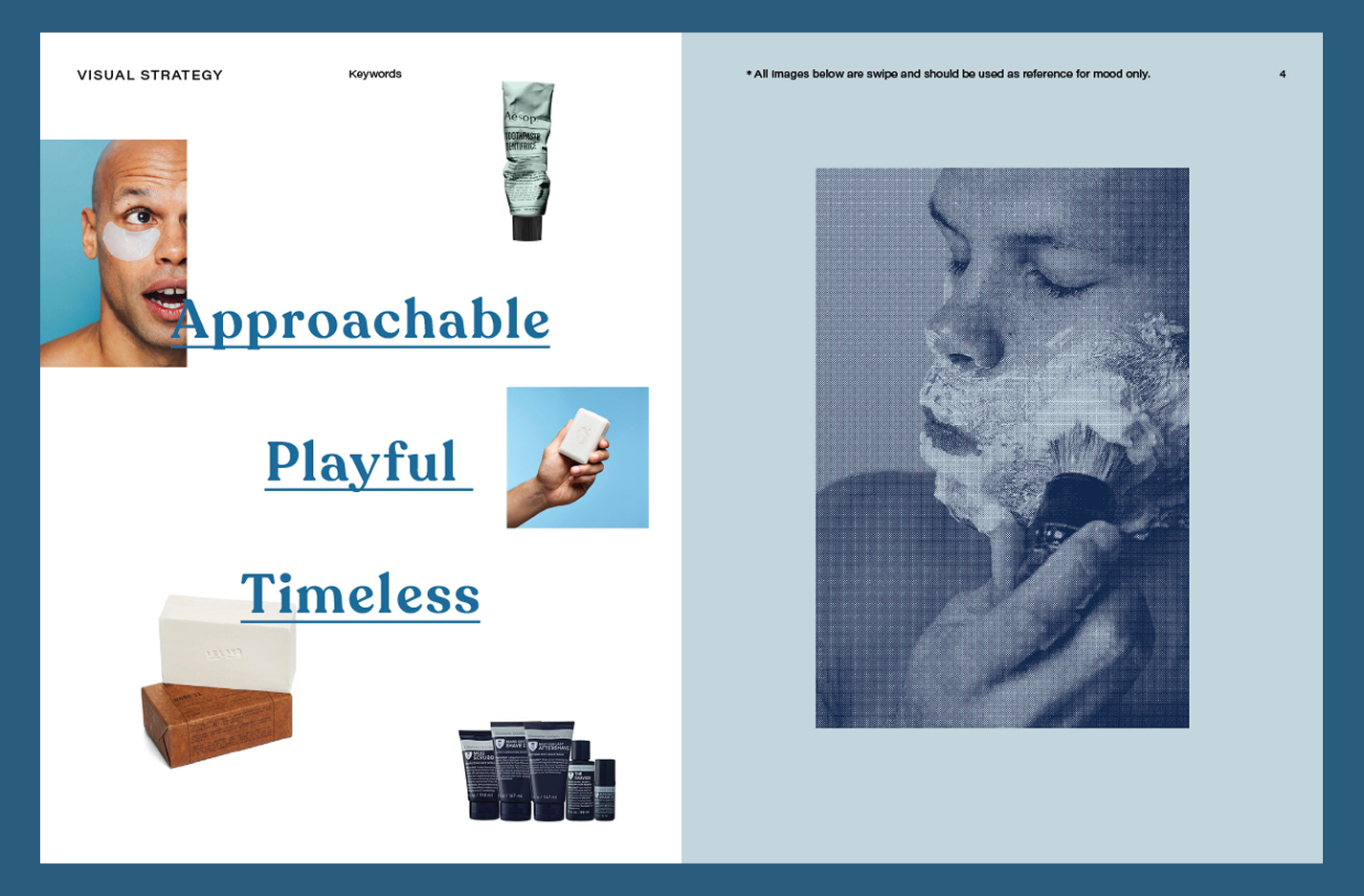
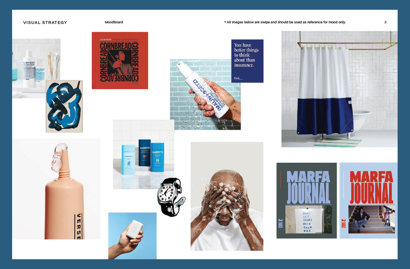
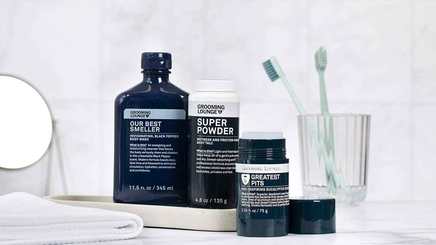
Grooming Lounge art direction utilizes natural lighting and bright backgrounds to contrast the dark navy packaging. Overall, it feels natural, fresh and modern. There's minimal propping such as tiles, water and towels to create depth and textures.


New and improved experience of the popular ‘Pick 4’ kit to drive more purchases for the in-house brand.


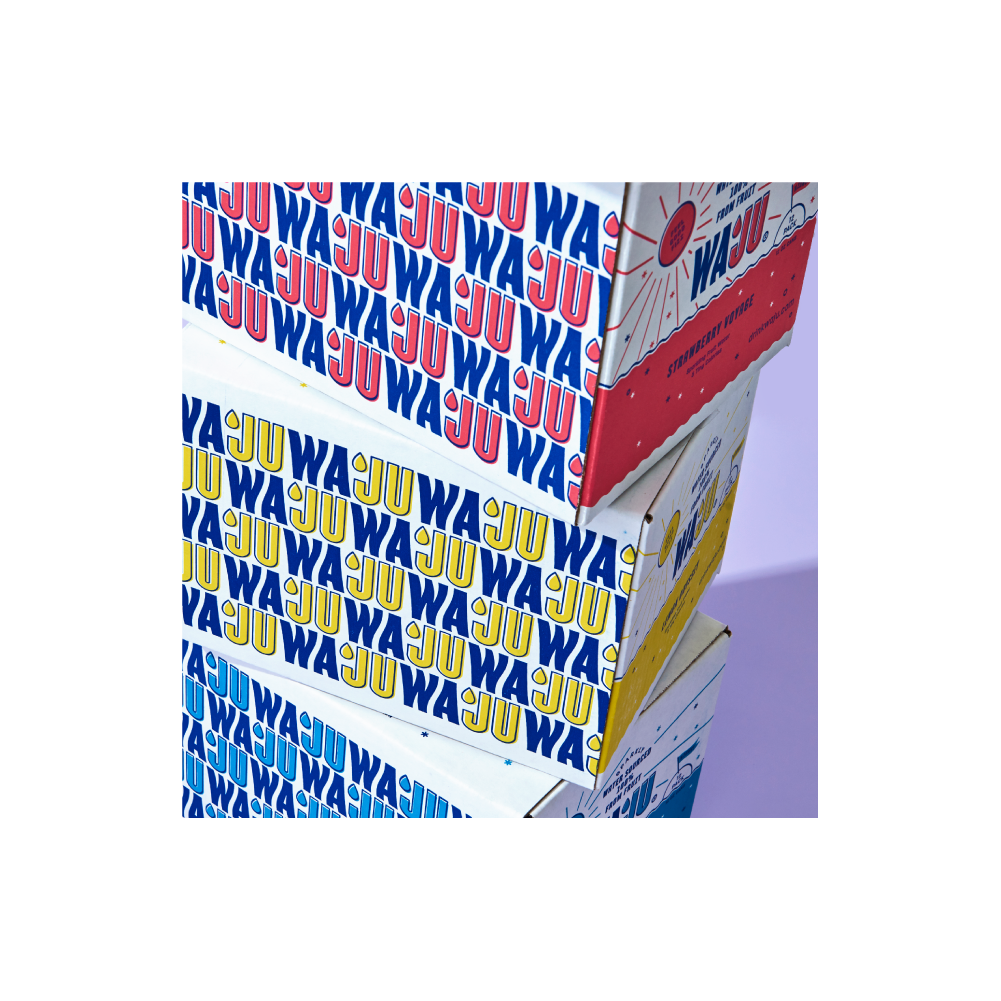
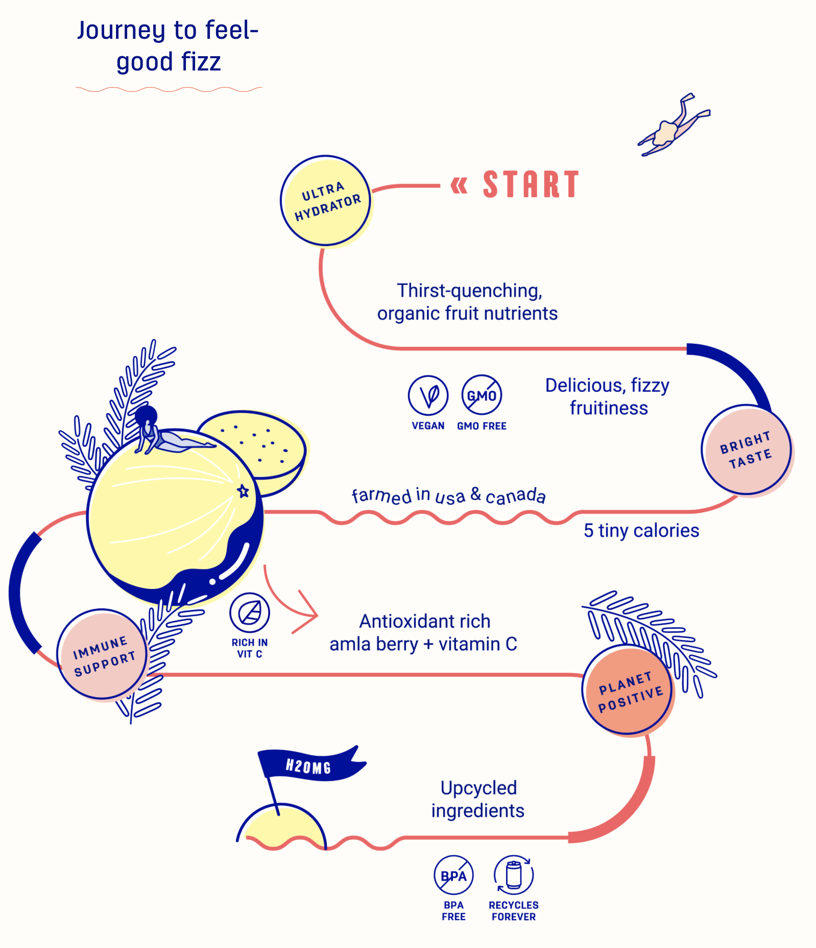
Waju
![]()
Client
Waju
Role
Art Director and Designer
creative direction
Deerfield
COPY
Summer Karaskova
Waju
Role
Art Director and Designer
creative direction
Deerfield
COPY
Summer Karaskova
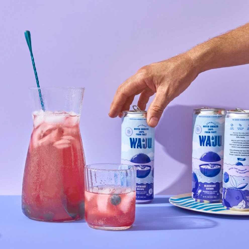
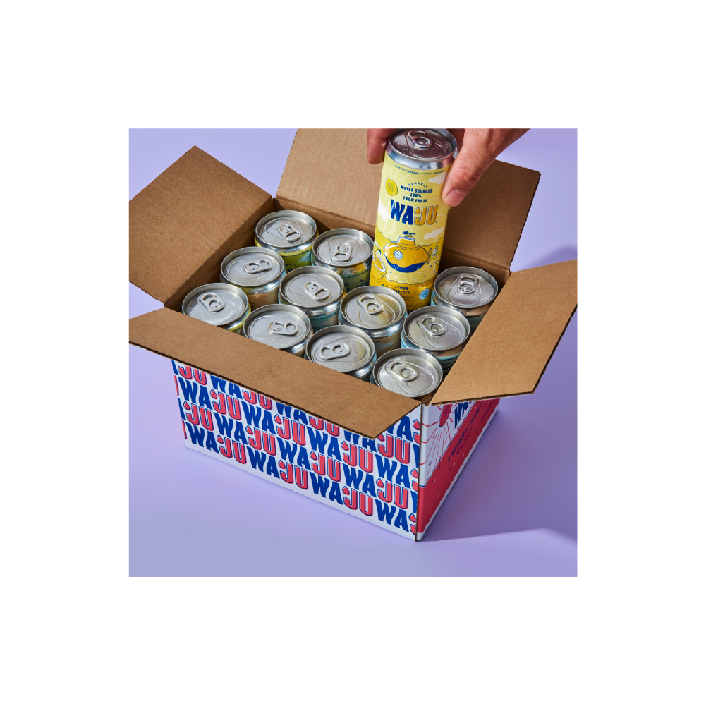
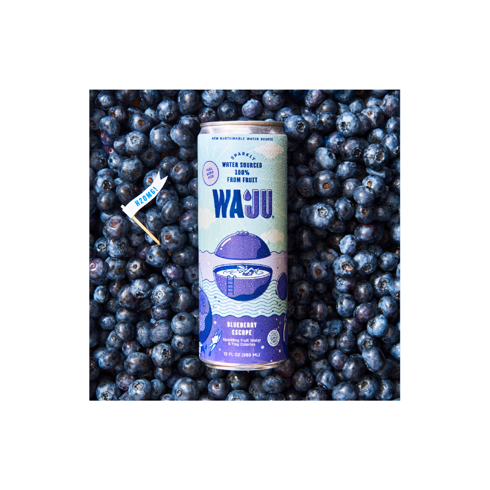
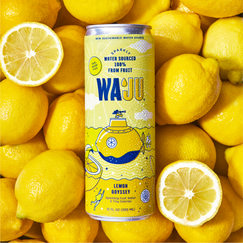
Overview
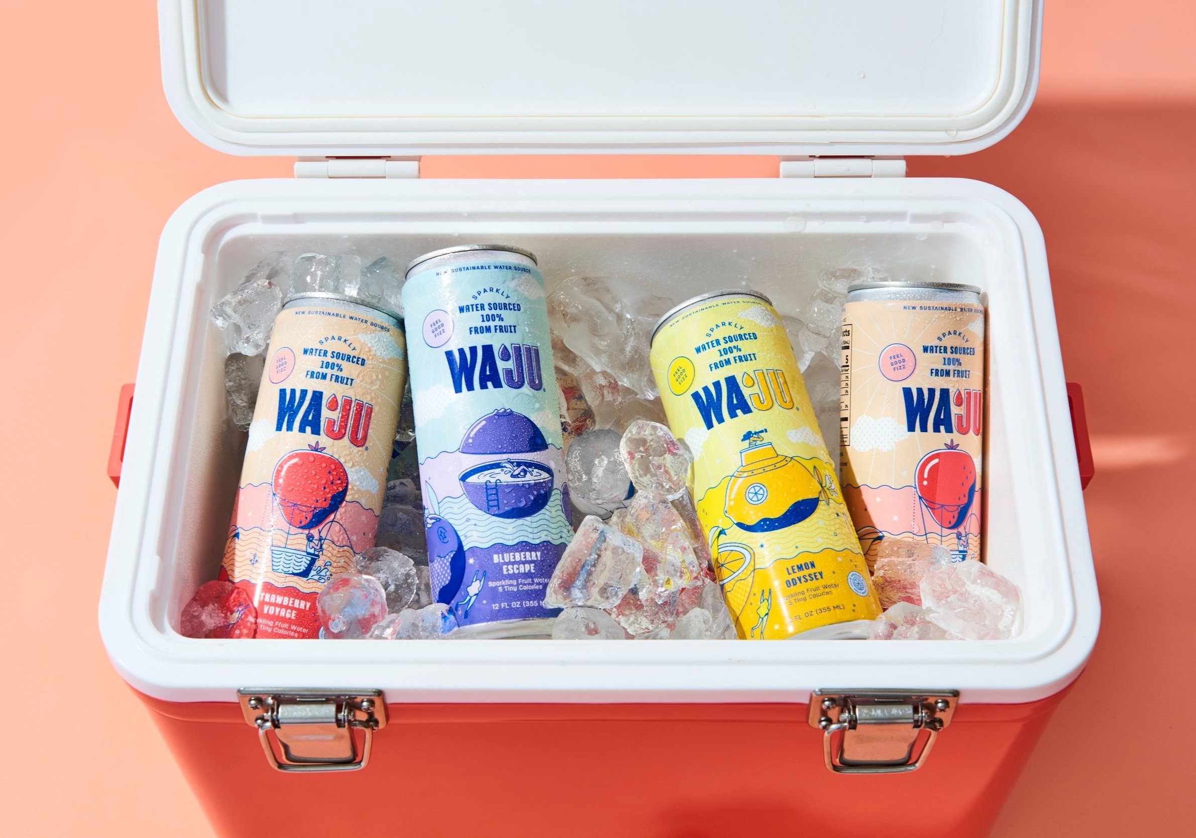
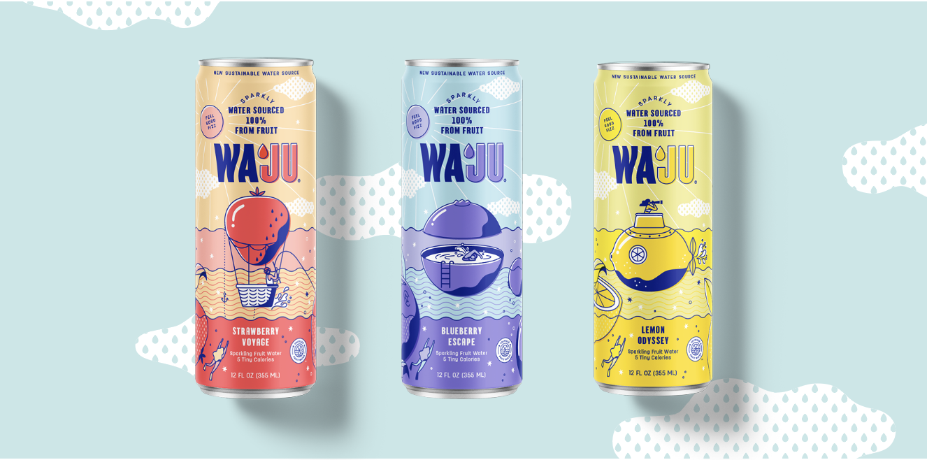
Waju has become the newest forefront for sustainable innovation and is unlike any other water out there. They had the ingenious revelation to start the only upcycled water in the world sourced from the naturally occurring water in fruit. The story behind this brand embodies a call to do things differently so we wanted to communicate this through touchpoints like comprehensive branding across packaging and web design. It felt only natural to dream up the world of Waju, where fantastical fruit vessels and vitamin nymphs pique curiosity and deliver the refreshing benefits of Waju in an unexpected and eye-catching way.


© 2025 Tan Chan. All Rights Reserved.